 iTunes 10 came out a few days ago with a bunch of new features, one of them being a new application icon. It’s pretty terrible. It lacks contrast, it’s dark, its over-saturated. It doesn’t follow Apple’s own guidelines on icon design and it doesn’t tell you much about the app itself, apart from the little note. Why the glossy shiny blue circle? What does it mean?
I’m not the only one who doesn’t like the new icon. Dribbble is full of icon replacements, all of them much better than the original. I tried a couple but ultimately couldn’t resist making my own, so here’s my attempt.
What is iTunes? To me iTunes is a music player–or more accurately, a media player. Yes, it also gives you access to apps and a shop, but its main function is still to play music; that’s what I use it for most of the time. I think the best way to represent that is with some media controls. The iPod’s click wheel is a very elegant solution to media player controls, and I think looks great as an icon itself. So no music notes on this icon–just the click wheel of an iPod.
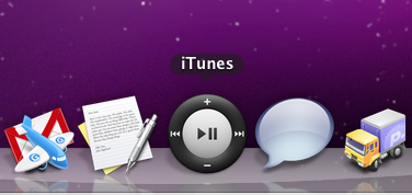
Here’s what it looks like in the dock:
You can download the icon here (zip contains a 512x512 transparent PNG, and an ICNS file) It’s not been optimized for smaller sizes, sorry. To use it on Mac OS X, go to your Applications folder, right click on iTunes and click on “Show Package Contents”. Navigate to “Contents/Resources/” and drop the “iTunes.icns” file in there to replace the old one (which you might want to back up first). You’ll probably need to type in your password as this action needs to overwrite Apple’s file.