Did you know that door hinges are attached to the door asymmetrically? The bottom one is further away from the bottom of the door than the top one is from the top of the door. It’s not a mistake by the manufacturer, it’s a conscious decision to make the distances look the same from the average point of view of a person looking at the door. Since they’ll be looking at the door from a certain height, most likely above the door’s center, if the lower hinge was placed at the same distance at the top it would look too close to the bottom. Our viewing angle skews our perception of the distance. To fix this we move the hinge up a little so it appears like the distances are the same.
I saw a blog the other day about how many websites fail to manage their color palette properly, leading to a lot of inconsistent colors in the stylesheet which should all have been standardized. For example, orange might be a dominant color on a website, but that website wouldn’t just use the same shade of orange, there would be a lot of shades of orange very near to each other. The commenter thought the designers weren’t careful, but it could very well be that the different shades of orange are purposefully chosen. After all, just like the door hinge, our perception of color varies depending on what else surrounds the colored area at the given moment. The illustration below is a great example of this.
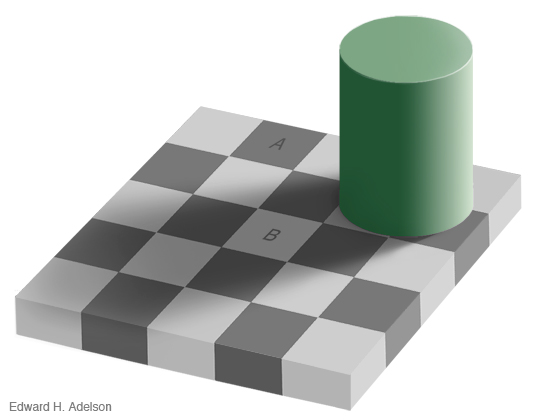
The two squares A and B in the above illustration are both the same shade of gray. Our eyes, however, take in the surrounding area, and change our perception of the two grays, making the shade at square A look a fair bit darker than at square B. It’s an illusion, yes, but it’s also real. What we see aren’t just exact, isolated, colors from the HEX values in our stylesheets, we see a different color depending on the context of its use, depending on its surroundings. Whether or not the stylesheet agrees, our brain processes a different shade.
The designers that vary the shade and saturation of their colors could simply be incompetent, but they could also be very good at their job. They could well be picking the color by hand to match the perceived color in the other places where it is used, and so even if the HEX is different, the actual color that people see may be very close to the same thing.
Craftsmen who get to carve and paint their work by hand might have the disadvantage of having to do a lot of manual labor compared to modern methods of mechanical mass production, but they have the advantage of not having the technology impose its own design decisions over their work. Because they have to judge the color and line by their own eye, they end up evaluating each in the context in which it is used, and they do it through the same subjective lens that the final thing is to be consumed.
On the other hand, our modern technology allows us to outsource the measurements for us. We pick a color and stick it into a constant, to be re-used throughout our stylesheet without a single variation. We set our line heights and our font sizes and our margins, and they remain the same throughout, pixel perfect. But while the measurements remain the same, the output is inevitably different, having to pass through the cloudy and subjective lens of our human eye and brain. We think we are in control, but we end up unwittingly surrendering our design decisions to the technology that we use.
I wrote about this before giving the example of Byzantine arches from Ruskin’s Stones of Venice. Byzantine architects decreased the distance from column to column slightly at the sides of the building as they transitioned into a narrow set of arches. It made the transition smoother, more gradual, more pleasing to the eye. The architect disregarded the rigid framework and relied on their own subjective judgement to make improvements. Today we’ve got the opposite feeling as cerebral designers embrace the precise measurements facilitated by the technology, disregarding subjective feelings and their own intuition.
But without intuition, without the subjectivity of human judgement, we create work that is only perfect for the machine, not man. Yes, the color, line or margin may have the exactly the same value in your stylesheet, but it might not look the same to us, which is the only place where those values really matter.
It doesn’t have to be this way. We can keep both, our technology and our intuition, as the example of the door hinge shows. All we need to do is remember the context in which the final product is to be used. If it is to be seen by the human eye, give it the judgement of the human eye. If things don’t look quite right, rely on your own intuition and taste to vary the measurements appropriately. Rely on yourself and your mind to make the design decisions that matter, not on the mindless tools and frameworks with which the product is made. The great value of technology is in extending the human mind, not putting a straitjacket over it.